Twitter and SharpieGate
Click here to return to the main page.
Introduction
Over the past several years, big data has taken the world by storm. Whether it is to figure out who is doing what and where, how Amazon figures out how to maximize shipping efficiencies, how a police force decides who to target, or how academics try to understand more of human nature, big data is opening up new frontiers in research possibilities.
Twitter is one such popular destination for people looking for big data due to the high volume of tweets created each day. Roughly 1% of Twitter users are location-enabled, enabling geographic analysis with enough tweets.
Disaster Strikes
One common use of Twitter data has been for disaster analysis, because people often go to social media to express thoughts, needs, or concerns about current events- and few things are more current than a disaster in your area. That is why it was a big deal when President Trump promoted an inaccurate portrayal of hurricane Dorian’s path by using a sharpie extension: Sharpiegate. The question that we asked, then, was whether or not this misleading image influenced people to tweet about Dorian at disproportionate numbers where Trump said there would be a storm but there was not. This in turn created two questions: Where were people tweeting more about Dorian, if at all, and then what were they tweeting about.
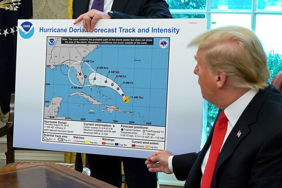
The basis of this lab involved streaming tweets using a Twitter API during the Dorian storm and over a baseline week during the month of November (2019). This was conducted by Professor Holler, who then provided us with the tweet datafiles to use in our analysis. Using both twitter data and US Census shapefiles in RStudio, QGIS, and GeoDa, this was a very open sourced project. While Trump made it seem like the Gulf Coast was under threat, hurricane Dorian in fact ended up making landfall in the Carolinas as a category 1.
Data and code
An important note about twitter data is that users are more likely to be technologically competent, younger, and able to afford a mobile or web connected device. When thinking about who is in the most danger from extreme events or other disasters, it is not people who have the means or capacity to act for themselves who are as at risk. This means that it is possible that some of the people who might have the most need to post about disasters are not able to.
On the flip side, data security is an important aspect of all social media work because of the tendency for people to share information about others. Sharing the location of a frail individual during a disaster puts that person more in the public eye- and perhaps more exposed to malicious intent (Crawford and Finn, 2014).
R code for text analysis and data creation
This SQL code was used in PostGIS for QGIS analysis.
Methods
Here is the RStudio code that I used to create the word graphics. The code used to make the data used in these scripts is commented in the SQL download link above.
Unique Word Frequency
dorianWords %>%
  count(word, sort = TRUE) %>%
  top_n(15) %>%
  mutate(word = reorder(word, n)) %>%
  ggplot(aes(x = word, y = n)) +
  geom_col() +
  xlab(NULL) +
  coord_flip() +
  labs(x = "Count",
       y = "Unique words",
       title = "Count of unique words found in tweets")
Word Network:
dorianWordPairs %>%
  filter(n >= 30) %>%
  graph_from_data_frame() %>%
  ggraph(layout = "fr") +
  # geom_edge_link(aes(edge_alpha = n, edge_width = n)) +
  geom_node_point(color = "darkslategray4", size = 3) +
  geom_node_text(aes(label = name), vjust = 1.8, size = 3) +
  labs(title = "Word Network: Dorian Twitter Events",
       subtitle = "Text mining twitter data ",
       x = "", y = "") +
  theme_void()
Here is the sql code that I used to connect the tweet data to the counties and to create the tweet ratios.
--This gives november a geometry.
select addgeometrycolumn('november', 'geom', 102004, 'point',2);
UPDATE november
SET geom = st_transform(st_setsrid(st_makepoint(lng,lat),4326), 102004)

--This changes the geometry to 102004
UPDATE counties
SET geometry = st_transform(geometry,102004);
SELECT populate_geometry_columns('counties'::regclass);

--This deletes the counties in states that were not impacted by Dorian.
DELETE FROM counties
WHERE "STATEFP" NOT IN ('54', '51', '50', '47', '45', '44', '42', '39', '37',
'36', '34', '33', '29', '28', '25', '24', '23', '22', '21', '18', '17',
'13', '12', '11', '10', '09', '05', '01');

--This adds a column for geoid to november.
ALTER TABLE november ADD COLUMN geoid varchar(5);

--This connects each tweet to its county.
update november
set geoid = counties."GEOID"
from counties
where st_intersects(november.geom, counties.geometry)

--This adds a column for geoid to dorian.
ALTER TABLE november ADD COLUMN geoid varchar(5);

--This connects each tweet to its county.
update dorian
set geoid = counties."GEOID"
from counties
where st_intersects(november.geom, counties.geometry)

--This adds a column to Dorian that is its total tweets.
ALTER TABLE dorian ADD COLUMN dortweet integer;
select count(status_id) as dortweet ,geoid
FROM dorian
GROUP BY geoid is not null

--This adds a column to November that is its total tweets.
ALTER TABLE november ADD COLUMN novtweet integer;
select count(status_id) as novtweet, geoid
FROM november
GROUP BY geoid

--This adds a column to my counties that is equal to the total november tweets, separated by county.
ALTER TABLE counties ADD COLUMN novcount integer;
update counties
set novcount= a
from (select count(status_id) as a, geoid
from november where geoid is not null
group by geoid) as nc
where counties."GEOID" = nc.geoid

--This adds a column to my counties that is equal to the total november tweets, separated by county.
ALTER TABLE counties ADD COLUMN dorcount integer;
update counties
set dorcount= a
from (select count(status_id) as a, geoid
from dorian where geoid is not null
group by geoid) as nc
where counties."GEOID" = nc.geoid

--This normalizes the dorian tweets by population (for every 10,000 people).
ALTER TABLE counties ADD COLUMN normaldor real;
update counties
set normaldor= dorcount/("POP"/10000)

--This changes null values to 0 in novcount.
update counties
set novcount = 0
where novcount is null

--This creates the ntdi in counties where there were tweets in either dataset.
ALTER TABLE counties ADD COLUMN ntdi real;
update counties
set ntdi= (dorcount-novcount)/((dorcount+novcount)*1.0)
where (dorcount+novcount)>0

--Makes ntdi have 0s instead of nulls so there are no null values in the dataset.
update counties
set ntdi = 0
where ntdi is null
Results
The Dorian Data
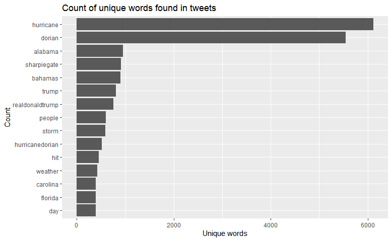
Unsurprisingly, hurricane and Dorian were the two most used words- especially because they are most likely used in conjunction and Dorian was the hurricane in question. After that, Alabama and Sharpiegate were both mentioned, soon followed by Trump and his Twitter handle. Other words commonly associated with storms are also found, including weather, hit, and locations such as the Bahamas and Carolina. This does make it seem like Sharpiegate was a hot topic of conversation- and it was. The question is then, how are these tweets separated.
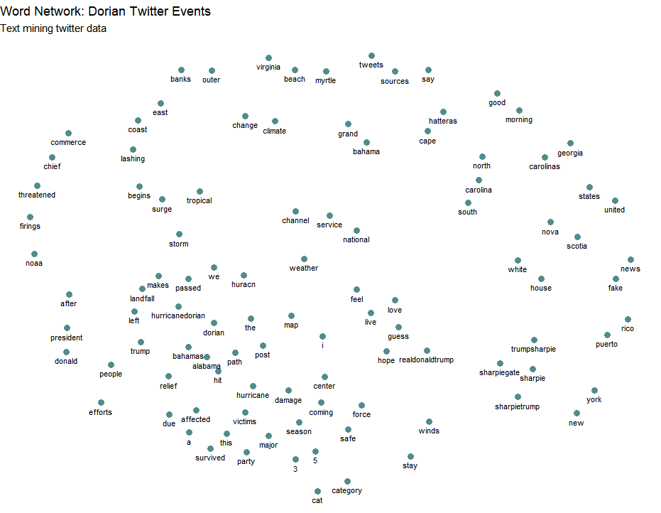
The bottom left of this network is predominantly focused on more disaster-oriented words, while the bottom right is more closely aligned with words I would associate with Sharpiegate, i.e. sharpie, fake. While there is not a hard distinction, the two groups do have separation between them. The top right of the network is devoted to locations, presumably because those were areas affected. Alabama is notably absent from that section (it is in the bottom left next to hit, which makes sense if people were asking if Alabama got hit because of Sharpiegate).
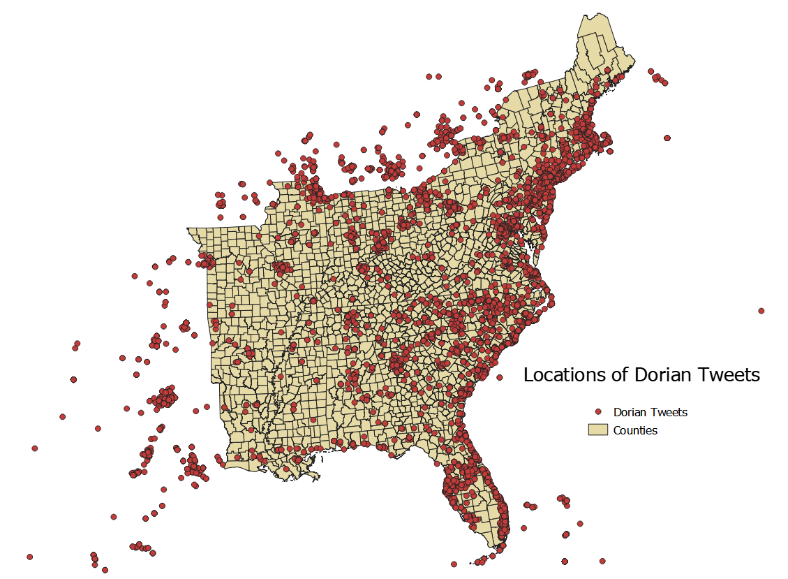
A visual test of where people were tweeting from during Dorian shows has a strong showing on the East coast which does make sense because of the population centers and the impact of the storm. What is notable is that there is no visual discrepancies in Western Florida or Alabama, the areas that Trump threatened with his sharpie.
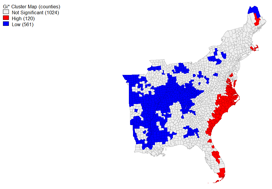
Using GeoDa (a convenient geographical statistical modeling software), I found the local G* statistic for the ntdi (normalized tweet difference index by county). Set to a significance level of 0.05, the coast- where Dorian hit- had the highest clustering of tweets about the event. Unsurprisingly, the unaffected western counties had a statistically significant amount of nothing to say while there was no significance to the tweeting in the Gulf Coast. It does not seem that Trump’s sharpie made waves. This map corresponds to the equation ntdi= (dorcount-novcount)/((dorcount+novcount)* 1.0 from the SQL section in methods.
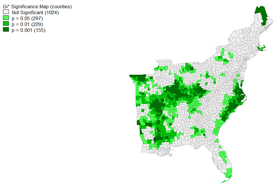
The map above shows a more detailed view into the significance levels of tweeting.
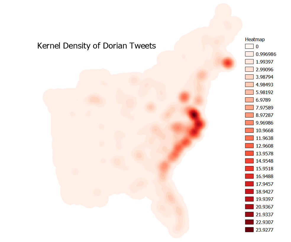
I used QGIS to make a heatmap of where tweets were coming from, normalized for every 10,000 people. This required fixing geometries, creating centroids, and then creating the Kernel Density map. I set the radius to 100km and the pixel size to 500m. The main takeaway here is that people tweeted at a higher frequency near where the hurricane made landfall, in the Carolinas. It also seems like the Massachusetts area got excited- either because Cape Cod was hit or because they love tweeting about Trump’s failings.
Conclusion
While people definitely tweeted about Sharpiegate and about Dorian, I found no evidence that people were duped into thinking that a hurricane was coming for them where none was. People seemed to have tweeted about each separately. While authors such as Wang et al. (2016) see an opportunity in geolocated twitter data because of how it is generated in real time for real events by real people, this data is far from perfect as shown by the efforts of this lab.
Each individual in this class found and contributed an article to a literature on twitter-based research, and a large proportion of the articles sourced were inductive- i.e. they took data, began working with it, and then figured out what stuck. Twitter has a history of inspiring and enabling such research because of the sheer amount of data available to researchers. From social networks to geographic location to likes to the actual body of the tweet itself and beyond, there is so much data within just a single tweet. Twitter is of course more than a research tool, however. It is only useful for academics because people in society take to the platform to express themselves, share information, have conversations, and more. It is a free-flowing conversation. Elwood et al. (2012) describe how volunteered geographic information is changing the academic field of geography and beyond. VGI is not limited to tweets, but can be anything from a geotagged photo to a forum like OpenStreetMap.
What is fascinating about this lab is that anyone with the technological know-how could have developed this problem and executed it. All of the data was available, and as far as open source software goes, RStudio and QGIS are relatively accessible. This brings up the question of what can research look like in this modern age of big data?
Oh- and it is also good to know that a statistically significant amount of people in the places that Trump lied about being in danger were not stupid or blind enough to believe him. This time, at least.
Citations
Crawford, K., & Finn, M. (2014). The limits of crisis data: analytical and ethical challenges of using social and mobile data to understand disasters. GeoJournal, 80(4), 491–502. doi: 10.1007/s10708-014-9597-z
Sarah Elwood , Michael F. Goodchild & Daniel Z. Sui (2012) Researching Volunteered Geographic Information: Spatial Data, Geographic Research, and New Social Practice, Annals of the Association of American Geographers, 102:3, 571-590, DOI: 10.1080/00045608.2011.595657
Wang, Z., Ye, X., & Tsou, M.-H. (2016). Spatial, temporal, and content analysis of Twitter for wildfire hazards. Natural Hazards, 83(1), 523–540. https://doi.org/10.1007/s11069-016-2329-6
Click here to return to the main page.